
Demystifying QR Code Color Contrast: Customizing Foregrounds and Backgrounds
Learn about QR code color contrast rules, discover how to customize gradients safely, and avoid common scannability design traps.
🔧 Interactive Utility Tool
Try the free, 100% secure client-side tool associated with this guide. No registration required.
Demystifying QR Code Color Contrast & Customization
Deploying custom QR codes in campaigns requires strict adherence to scanner specifications. Here is how grid contrast works.
A QR Code is a two-dimensional barcode storing data inside a grid of dark and light modules. Scanners decode this grid using error-correction math, allowing for fast scannability even when the code is partially damaged.
When brands design custom QR codes, they often customize them to match their brand colors. However, if the color choices do not provide sufficient contrast, camera sensors will fail to distinguish between the background and foreground modules. This results in slow scanning speeds, or codes that fail to scan altogether.
In this guide, we'll cover contrast ratios, explain why inverted colors confuse scanners, and detail safety customization rules.
Product-Led CTA: Creating scannable QR codes requires compliant borders and high contrast. Generate web-ready graphics instantly using our free, browser-based Custom QR Code Generator with custom error correction.
⚡ Quick Action: Use the Online Tool
This guide pairs with our free, 100% secure client-side utility tool. Process your files or text instantly in-browser.
📐 The 4:1 Contrast Ratio Rule
A camera reads a QR code by converting the image into binary values (pure black and pure white). To ensure the processor can tell modules apart under varied lighting:
- Minimum Contrast: Maintain a minimum contrast ratio of 4:1 (or 40% difference in light reflectance) between the foreground dots and background canvas.
- Optimal Setting: Use a dark foreground (black, dark blue, deep purple) on a light background (white, light gray, soft cream).
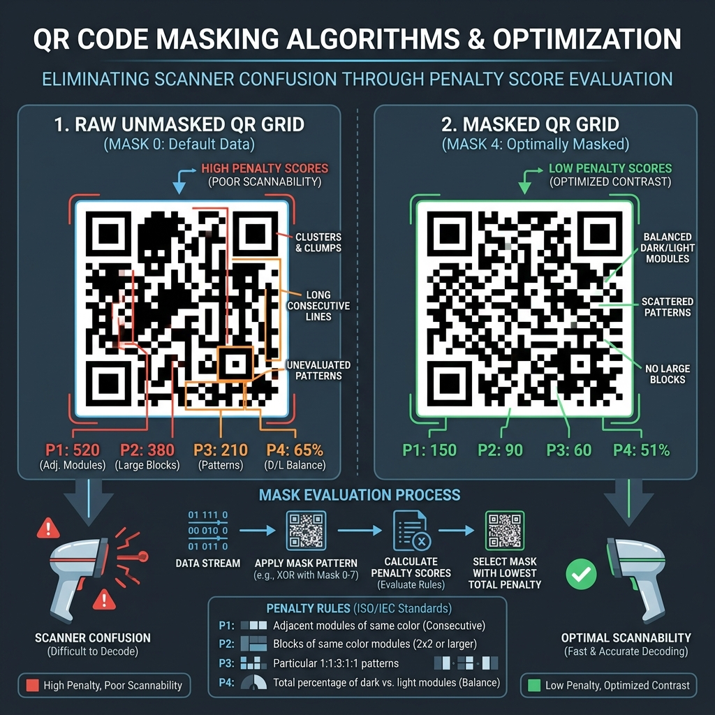
📊 QR Code Scannability Reference
Below is a technical infographic illustrating how module layouts and masking parameters are balanced to prevent reading errors:
⚠️ The Trap of Inverted QR Codes
In standard QR codes, the background is light and the foreground modules are dark. Some designers generate "inverted" QR codes (light modules on a dark background) to fit dark UI modes:
- The Issue: Many older or lower-end scanner applications assume that foreground data modules are always dark. When presented with a light-on-dark code, they fail to locate the finder patterns.
- The Fix: Always design QR codes with a light background. If an inverted code is necessary, ensure there is a thick, light "quiet zone" border around it to help the camera identify the boundaries.
🎨 Rules for Customizing QR Designs Safely
Keep these guidelines in mind when styling:
- Avoid Gradients Across the Code: If the gradient shifts from dark blue to light cyan, parts of the QR code will lose contrast against a white background, causing scan failures in that region.
- (See our QR Code Naming & Campaign Tracking Guide for details).
- Choose Proper Masks: Let the generator optimize module distribution to prevent scanning errors. (See QR Masking Algorithms Guide).
- Create Custom QR Codes: Paste your link into our browser-based Custom QR Code Generator to select error correction levels and compile clean, scannable files.
Join the Urbandigistore Hub
Subscribe to receive premium developer cheat sheets, advanced conversion techniques, and campaign optimization checklists. Zero spam, unsubscribe anytime.
🚀 Launch Interactive Tool
Ready to test this directly? Open the secure web tool in a new sandbox tab.